Sunday 30 September 2012
Saturday 29 September 2012
Double Page Spread #3

Masthead
The masthead is slanted and this could be a reference to the band being rebelious or crooked. This works well with the "Pop Punk" image of the band. The white text against the black background really stands out and catches our eye. More than the red text at least.
The text has been texturized and looks like it has been sprayed onto gravel or onto concrete. Again refering to the rebelious nature of the band, it could symbolise grafitti.
Images
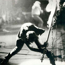
The images are shot in black and white to sybolise traditional or classic rock. These shots are mostly of the band recording and or playing. This gives us a behind the scenes look into the band and is almost a second exclusive to see how the band work behind the scenes.
NME Cover Analysis 3

The Masthead
The masthead breaks the norm for NME magazines. This one is a gradient from purple to pink. Traditionally the NME logo is black white and red. This instantly tells us that it's a special or new edition.
The Feature Article
The featured artcile is of Jimi Hendrix. As this is the 40th anniversary of his death edition it is only about him.
Surrounding text
The purple text surropunding the image are little previews. An Idea that I'm now considering.
Friday 28 September 2012
Double Page Spread #2
Background

The background is a deep purple. This could be a refernece to Hendrix's song "Purple Haze" which is a metaphor for drugs. This magazine could be refering to Hendrix's drug use and that he became known for drug use.
Masthead

The masthead looks as if it was painted on and it still has stroke marks. The funky type text again goes along with some of the main things that were associated with Jimi Hendrix.
Main Picture

The fact that Hendrix is smoking again plays to the them of drugs.
Double Page Spread

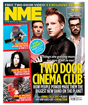
The masthead is a play on words seeing as the main focus of this article's name is Will.I.Am. The gold and grey contrast of the text is very eyecatching as they are two colours that don't tend to be put together. The rhetorical question in the pun is aimed at older and more eductaed audiences.


In the picture Will.I.Am is in gold and his ex-bandmates have a lowered opacity so that Will.I.Am is the main focus of the picture. This is very effective in taking the attention.
NME Contents Analysis 2
NME Cover Analysis 2

The layout is all about focusing the attention to the featured article. As you can see the featured article is considerably bigger than all of the others and your focus is instantly draw to it. The pictures are all different sizes and this demonstrates the magazine and how abstract and different it is.

The title is in a bold font and the font itself looks to be from a newspapert or a typewriter. This is probably an attempt to bring some nostalgia to the magazine.

The featured article is very large as I mentioned before. The black and white photo again brings more nostlgia and again backs up the point that this isssue of NME is a classic and that it is the only magazine that is still true to the roots of rock and roll because of its black and white images.

The neat and organised 'Plus' tab is very well organzise and bold so it is very easy to see the page numbers and the articles. I will probably use a format like this to make my contents page.
Thursday 27 September 2012
Production Log #6 (27/09/2012) - Organising My Photo Shoot.
My photo shoot is coming up... The 5th of October. I currently have about 3 friends on board to be my victims but I'd prefer to have more because that way I'll have enough in case some drop out.
So far my plan is to get as many shots as I can of people holding guitars, microphones and other instruments.
Maybe even some group shots so that I can fabricate a band and that way I will have multiple back stories to talk about and the interviews will feel less like interviews and more like conversations.
Some ideas courtesy of google:
Production Log #5 (27/09/2012) - Researching Covers
Lately I have been stuck for decent ideas for my covers.
My plan is to go onto the NME website (http://www.nme.com) and find some bands I like and see the layouts of the front covers. So far I have found:

I like the way that it looks like he is holding the text. Also the medium shot is very effective in making the band seem like normal everyday people.

I like the way that it seems like Kele is holding the text. I see this as one of the things that I might implement in my photo shoot.
The other articles down the side appear to be on a form of camera roll. This looks very good and could be easily added and very effective.
My plan is to go onto the NME website (http://www.nme.com) and find some bands I like and see the layouts of the front covers. So far I have found:
I like the way that it looks like he is holding the text. Also the medium shot is very effective in making the band seem like normal everyday people.
I like the way that it seems like Kele is holding the text. I see this as one of the things that I might implement in my photo shoot.
The other articles down the side appear to be on a form of camera roll. This looks very good and could be easily added and very effective.
Production Log #4 (27/09/2012) - Catching up
As i'm writing this I am sitting at home secluded in my bedroom attempting to catch up on the media work. I am doing this to take a load off of tomorrow's lesson. This well help me greatly because it will allow me to focus on more pressing matters tomorrow such as making my blog look nice and finishing off blog posts. As opposed to me having to do 6 or 7 analysis pieces tomorrow.
So far I have completed 2 NME covers and 1 NME contents page.
View them by clicking on these links named:
So far I have completed 2 NME covers and 1 NME contents page.
View them by clicking on these links named:
NME Cover Analysis - The first NME cover (Gorilaz)
NME Cover Analysis 2 - The second NME cover (Biffy Clyro)
Contents Analysis - The first NME Contents page
|
NME Contents Analysis
Featured Article

The main article is very eye catching and bold. The picture is the main thing that catches your attemtion. With the bold font saying "THE END OF THE ASTORIA" in black you get a sneak preview.
Other Articles

The other articles are well organised and very easy to navigate. This is key because if someone picks up your magazine in a shop and wants to have a quick flick through before they consider purchasing it you'd want them to be able to find their desired article with ease as to not cause them frustration and ultimately end in them putting your magazine back.
Band Index

I thought this was a nice touch by NME because it meant that if a reader was looking for a specific band and they wanted to see if that band was in there before purchasing then they could look in the band index.
Masthead
The masthead of the contents page is a large banner saying "NME THIS WEEK" this is very eye catching and the colours make it stand out. The white against black is very classic and brings class to the magazine. The NME logo is now very well known so that has to remain the same as to not cause controversy.
Sunday 23 September 2012
Production Log #3 (23/09/2012) - Front Cover Analysis
In today's lesson I spent my time analysing front covers.
I did so by:
First taking an image of a front cover that I liked, then putting it into paint and cutting it into different sections. These sections were determined by what I wanted to talk about. I would have used Photoshop if I wasn't on a time limit and I wasn't too lazy to open it and wait for it to load.
Once I had the images I liked I then added them to my blog under the title NME Cover Analysis 2. Then I added the text.
Monday 17 September 2012
NME Cover Analysis 2
NME Front Cover 2

Main Article

The main article has an interesting title. The use of boxes give off an impression that it is a cut out. The black and white suggests a classic theme. The bold and agrressive font allow the audience to see Biffy Clyro as hardcore or tough. Biffy Clyro are also given a mainly stance because the text isn't fancy slanted suggests edge to the band.
Masthead

The masthead is big and bold and in red. This attracts the attention of the people walking past. The masthead over lays the main picture which does take the focus away from the main picture.
Sell Lines

The sell lines are in red. This allows attention to be brought to them without taking too much away from the main article. The lesser imformation is underneath this means that it isn't too important and you don't have to read it.
Production Log #2 (17/09/2012) - Front Covers
Today we were looking at front covers. I opted to take two NME covers and cut them up using paint so that I could higlight the different sections easily instead of having my reader find it for themselves. I found this helped me work it out much easier.
For reference view posts titled:
NME Front Cover
and
NME Front Cover 2
For reference view posts titled:
NME Front Cover
and
NME Front Cover 2
Sunday 16 September 2012
NME Cover Analysis

This is the cover of an NME magazine.
Masthead

The masthead is behind the main image, this was most likely done because they didn't want the masthead taking away the focus from the main image. Although some of the masthead is hidden pretty much anyone who buys this magazine will know what the rest of it looks like so it doesn't really matter.
The masthead is in red mainly with an outline of white and then another outline of black. The red and the white go nicely together enabling our attention to be drawn to it. The black outline on the white is mainly to ensure that we can actually read it against the background.
Main Article

"Reality Blurs!" Is a play on words seeing as the lead singer of Gorillaz (Damon Albarn) used to be in a Brit pop band called blur. This play on words allows a bit of nostalgia to the fans that followed Albarn back in his blur days. It also serves as a reminder to the fans who only know him from Gorillaz that he was in a band before Gorillaz. Damon interviews Gorillaz is also a jokey section of this title. Seeing as the lead singer of Gorillaz is called Damon and the band are portrayed as animated characters with separate names and back stories it almost gives off the feel that we aren't speaking to Albarn any more we are now speaking to the band members of Gorillaz.
Colour Scheme

The colour scheme is quite dark and grimey with a few colours that really pop out.
The main colours are:
-Red
-White
-And this greeny-blue colour that is speckled across the page.
This gives of the feeling that this band is grimey and unkempt, fans of Gorillaz already know that this is actually how the band wishes to be portrayed.
Other text
The white text pops out and draws us to the bottom of the page. Although it only pops out a little bit to make sure that it doesn't draw away focus from the main article. The acts are separated by stars as opposed to bullet points, hyphens or even just spaces. This makes a nice change and breaks the norm. These acts don't have any other text following them they just have their names, this keeps the audience guessing and makes them want to read on.
Friday 14 September 2012
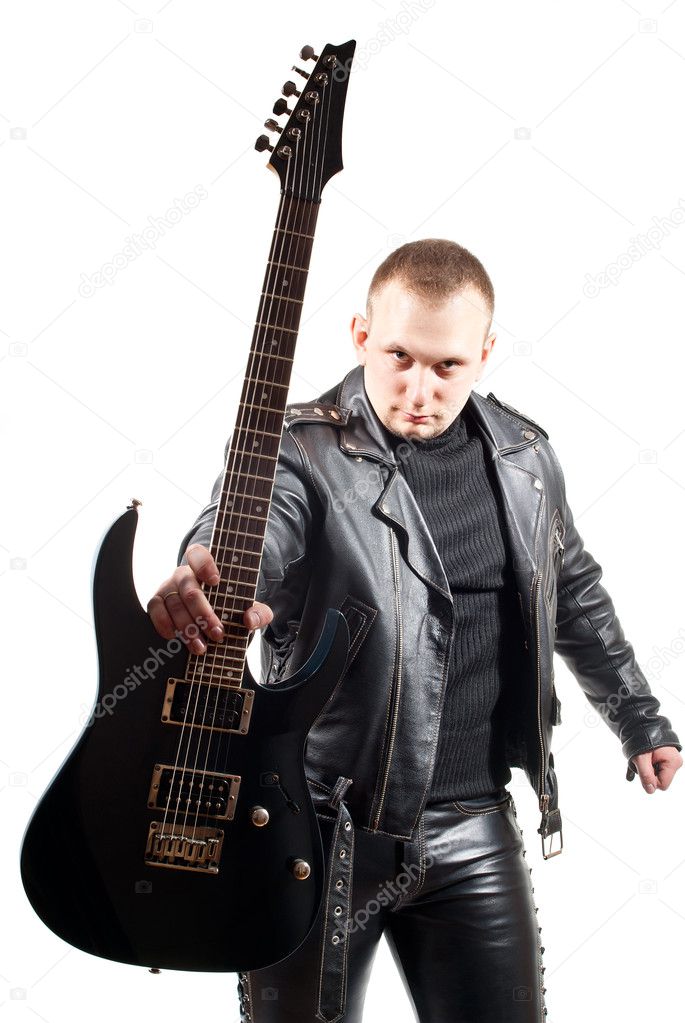
Ideas For My Magazine Cover Layout

I like the layout of the text "Biffy Clyro" because it is see through and you can see the picture behind it.
I also like the banner at the top. That might be an idea that I'd use.

I like the placement of the articles at the bottom, especially the banner behind the text. I think it looks good having the text overlaying the picture.

I like the picture and how it overlays the title and looks completely separate to the magazine.

I like the big title in the middle of the page. It makes it really eye catching and draws your attention to it instantly.
Monday 10 September 2012
Haydon Magazine Contents Page

I used the opacity tool to change the picture I used on the front cover to give off the effect of looking at it through a glass window. I then used the place feature to add 3 other pictures and I used these as teasers for the articles.
Haydon Magazine Front Cover

Using the text tool I was able to shower my page in text. By placing my articles of the left hand side I managed to keep the main focus on the picture instead of the articles. The use of yellow in my magazine is very eye catching. This was a goal of mine. I place a logo in the top for Josling Media which is a company that I made up to add a little bit of realism to my magazine.
Sunday 9 September 2012
Production Log #1 (09/09/2012) - School Magazine
In today's lesson we were given the chance to go around the school and take pictures for a school magazine. I was in a group with Luke, Ashley and Ciaran. First we went to the link to use the office to take a picture of Luke sitting at the desk. Next we went to the library and took pictures of Ciaran reading a book. After that we went to the PE office and borrowed a trophy and a football so that Ashley could pose in front of the goal. Once we had returned we got onto the computers and opened up Adobe Photoshop CS3 and started on the covers for our magazines. I went with the title: "Haydon News" my main image on the front cover was the picture of Luke sitting at the desk. The subheading said "Teachers set for pay rise next year." I also included articles about the library and the football team. Once I had finished the front cover I moved onto the contents page. I started with the same picture of Luke that I had used on the front cover but i opted to turn the opacity down from 100% to 50%. My first lesson was very productive. I have finished the magazine.
Subscribe to:
Posts (Atom)